|
|
|
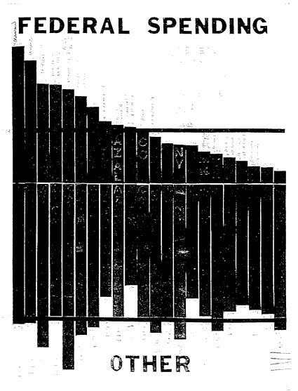
New Article: New Article: New Article: New Article: New Article: Core Concepts: Core Concepts: Graph: Graph: Graph: Graph: |
Changes in military spending have had a large impact on the history of the Cold War. The lowest military GDP% of the Cold War helped reelect Truman in 1948 after three years of negative growth. The largest one year peacetime increase in military spending created the 1982 highest unemployment of the Cold War. Military cuts triggered the early sixties boom and the nineties boom in the economy. The three year slump after WWI may have hurt Wilsons efforts to join the League of Nations War economies only boom if deficits support the boom. Paying for the war can ruin an economy. Every war is followed by a recession, the bigger the war the bigger the recession. Both World Wars were followed by three year drops of 15% of GDP. The Cold War was also followed by a three year increase in unemployment, and Vietnam was followed by a two year slump. The militaristic nature of football helped beat baseball out of the favorite sport spot during the Cold War. The military cuts of the early sixties and the post Vietnam seventies may have economically boosted the Green Bay and Pittsburg dynasties coming from low military areas. The Reagan military buildup may have helped high military area teams like San Francisco, Washington, and Dallas in the end of Cold War period.
|
|
REAL ECONOMY |